Valeti is a parking marketplace, a platform connecting drivers to parking spots near their destination, whether an airport, stadium, arena or event venue. The experience mirrors the logic of ride-hailing apps: search by destination, see nearby options, reserve a spot, arrive and pay through the app.
The product already existed but had been built by developers, functional but without a coherent design logic. High friction, unclear communication, steep learning curve. Beyond the consumer-facing experience, Valeti also offers a management solution for parking operators: a terminal, a desktop system and an operator app. Our discovery covered both sides of the ecosystem.
The core UX challenge wasn't just usability. Valeti was introducing a new behavior, reserving a parking spot in advance, through an app, to a market not yet accustomed to it. Communicating the value clearly, building trust early, and removing every point of hesitation were as important as the flow itself.
Discovery mapped two distinct user journeys: the driver looking for a spot and the parking operator managing their lot. Both were underserved by the existing product, but for different reasons.
For the driver, the core friction was trust and clarity. Reserving a spot in advance was an unfamiliar concept, users needed to understand what they were getting, why it was worth paying upfront, and what would happen on arrival. Every step was a potential drop-off.
For the operator, the challenge was operational: managing real-time occupancy, entries and payments through a system with poor usability and high staff turnover. The interface had to work without training.
We benchmarked extensively across ride-hailing, hotel booking and event ticketing to understand which interaction patterns users already trusted and how to adapt them to a parking context.
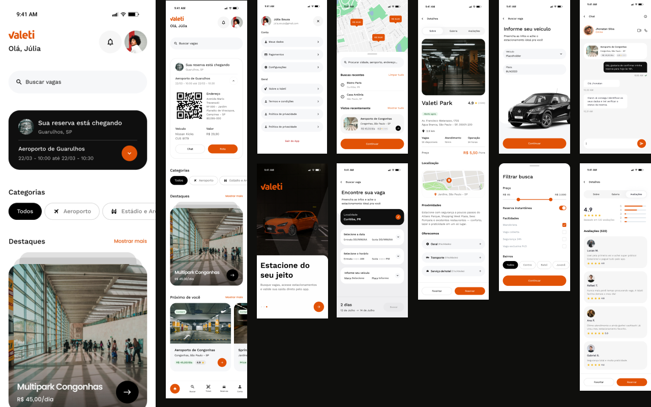
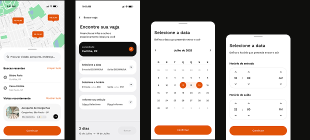
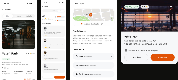
Consumer marketplace. A redesigned web and mobile experience built around the driver's mental model: destination first, then nearby options, then decision. The search and results flow surfaces the most relevant information at each step, distance, price, availability, amenities, without overwhelming the user before they are ready to decide.
Onboarding and trust. For a new product introducing a new behavior, the first impression is critical. We designed an onboarding flow and first-use experience that clearly communicates the value proposition, sets expectations about how the reservation works, and removes the main sources of hesitation before they become drop-offs.
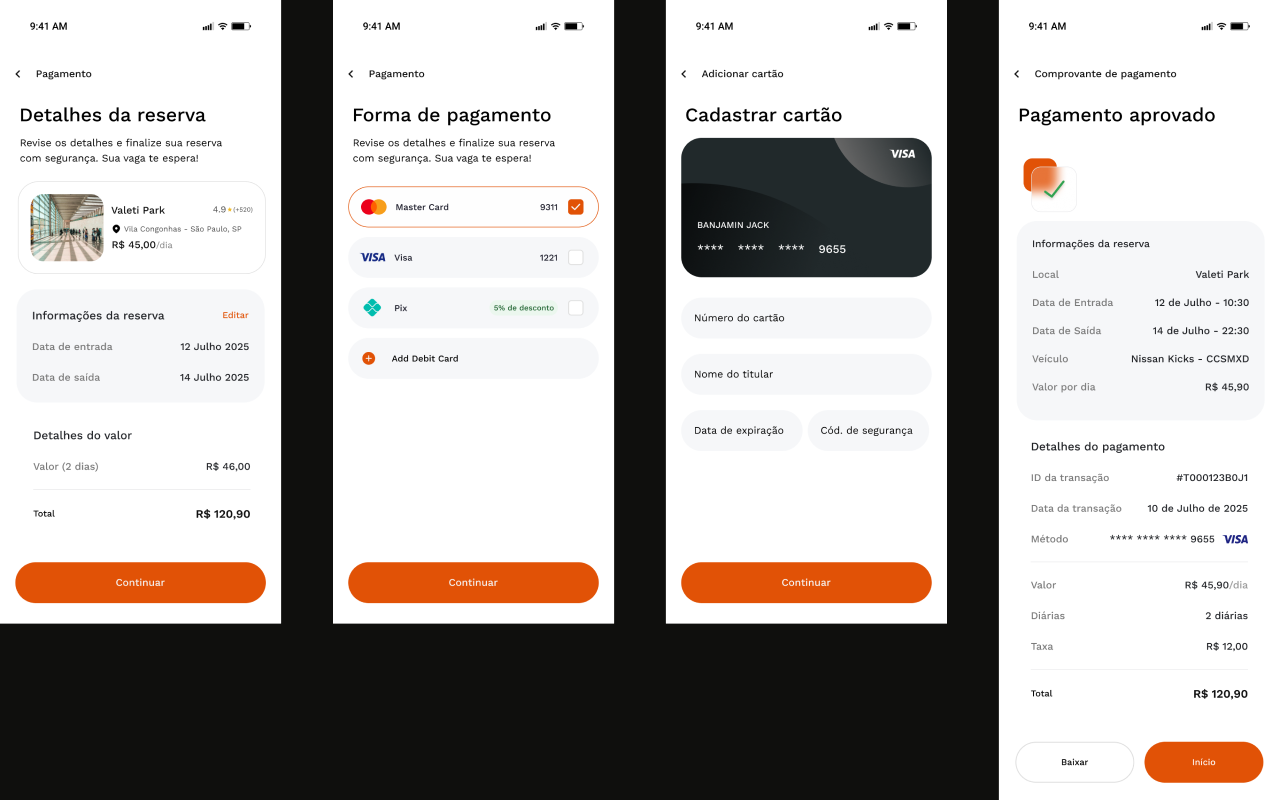
Reservation and payment flow. A streamlined end-to-end flow from spot selection through reservation confirmation and in-app payment. Designed for the physical context, a driver about to park, with clear status communication at every step and a frictionless checkout.
Operator management solution. Alongside the consumer product, we redesigned the operator-facing tools: a payment terminal for attendants, a desktop dashboard for lot managers, and an operator app. Each surface designed with its own interaction philosophy, single-task focus for the terminal, at-a-glance oversight for the dashboard.
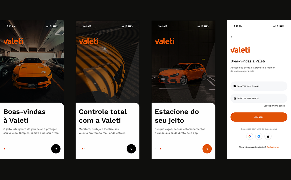
Reserving a parking spot through an app was a new behavior for most users. The onboarding experience was designed to explain the product, set clear expectations and build enough confidence for the user to complete their first reservation. Every screen reduced a potential reason to abandon.