Rede Torra is a large-scale retail chain focused on affordable products. Like most retailers at their scale, they moved into financial products, credit card and personal loans, as an additional revenue stream. The product is called Dinq. They came to us wanting a standalone financial app, separate from their existing e-commerce experience.
Through discovery, we identified that separating the two experiences was a missed opportunity. The financial products and the retail experience could reinforce each other, card holders getting exclusive discounts, loan users getting purchase advantages. We proposed a superapp unifying both. That was too large a step given their internal technology constraints, so we designed plan B: a standalone financial app with the e-commerce deliberately present inside it.
The audience added a layer of complexity. Torra's customer base skews older, with lower digital literacy and high exposure to financial fraud. This demographic needs warm, clear, trustworthy communication above technical sophistication.
Discovery covered the full landscape: customer profile through quantitative and qualitative research, benchmark of financial apps serving similar demographics, and the internal technology constraints that would shape what was deliverable.
The audience research was decisive. Torra's customers carry justified anxiety about digital fraud. Any experience that felt complex, cold or unfamiliar would create abandonment before the product had a chance to demonstrate its value.
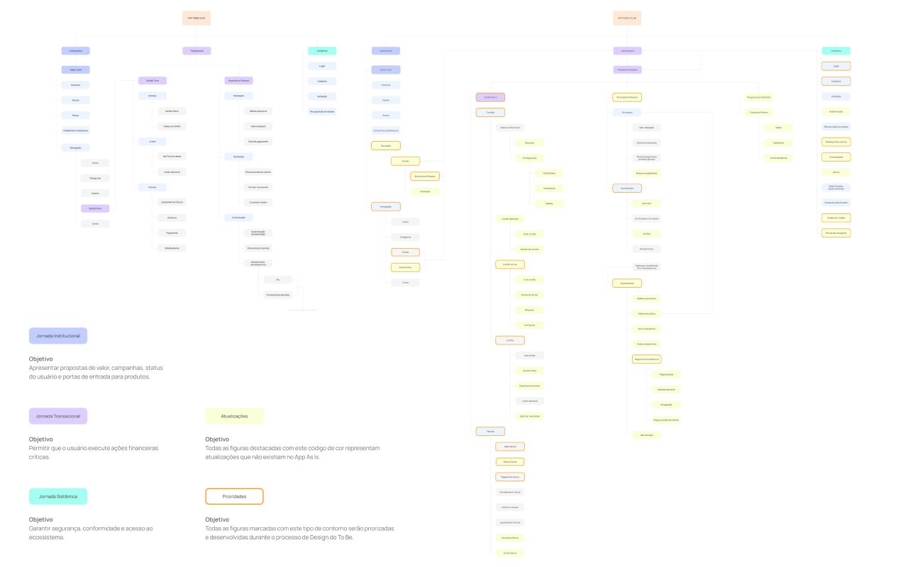
We mapped the full information architecture before touching any screen design, covering all product areas, flows and content relationships. The IA became the strategic foundation everything else was built on.
We also developed a product manifesto and a tone of voice system defining how Dinq speaks to its users across every touchpoint. For a demographic that has learned to distrust financial products, the voice of the product is as important as the interface.
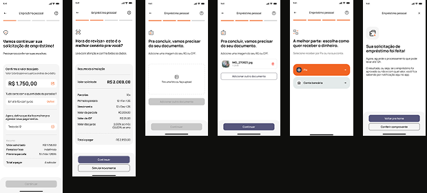
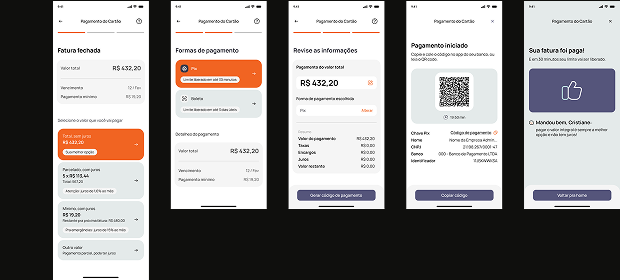
Financial app with e-commerce presence. A financial app where Torra's retail experience has a deliberate place. Card holders see exclusive discounts. Loan users see purchase advantages. The e-commerce section surfaces promotions tied to the financial products the user holds, a loop where each product makes the other more relevant.
Audience-first UX. Every flow designed for an older user with lower digital literacy and fraud anxiety. Clear progressive disclosure, no jargon, no ambiguity about what is happening at each step. Security made visible, not assumed. The experience communicates trust through warmth and clarity.
Tone of voice and communication system. A full tone of voice manual for the product, warm, direct, honest, human. Banner system, notification patterns and content guidelines covering how financial and retail content coexist without competing. A communication layer designed specifically for a demographic that has learned to distrust financial products.
UI kit and foundations. Complete component library and design foundations built alongside the product flows, enabling the internal team to evolve the product independently after delivery.

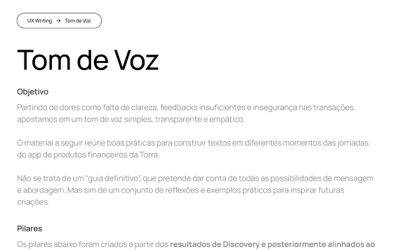
Torra's audience has learned to distrust financial products, often for good reason. The tone of voice system was designed to rebuild that trust through warmth, clarity and radical honesty about costs and terms. Not reassurance. Not marketing language. A voice that speaks to the person, not the transaction.