Portfel is Grupo Primo's investment advisory arm. After completing financial education courses, clients are referred to Portfel's consultants to invest their money. The brief was simple: build a portfolio balancing tool for consultants. Nothing existed, the starting point was a basic extranet with no functionality.
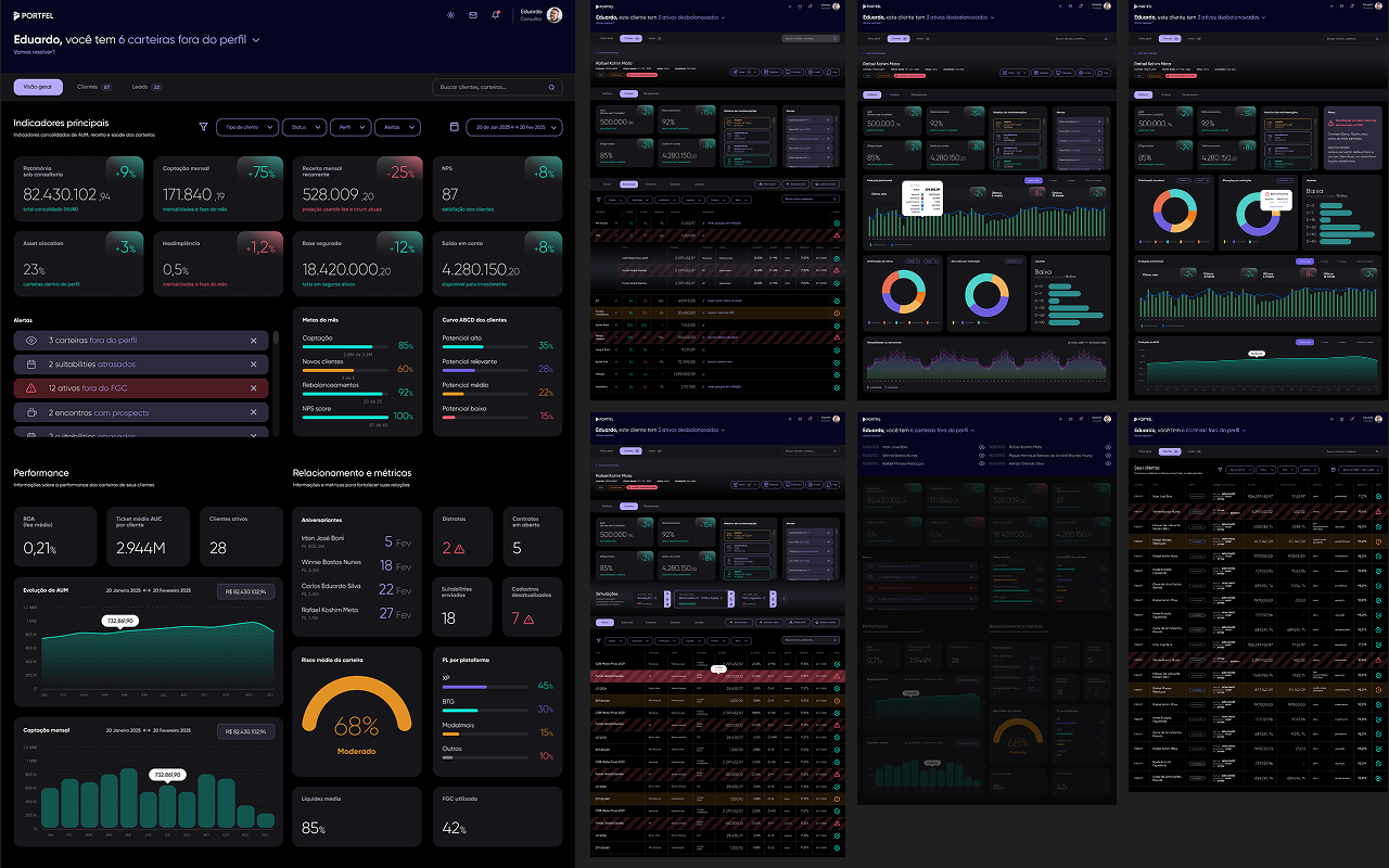
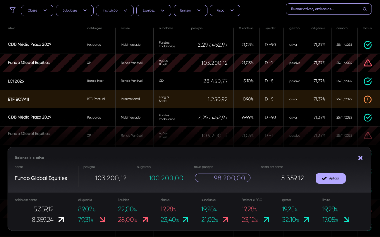
Portfel operates with a proprietary methodology defining specific allocation targets across asset types. When portfolios drift from those targets, consultants needed to identify and correct imbalances, while understanding the cascading effect of every adjustment before making it. We scoped the first module around this core need, with the larger platform vision documented for future phases.
Discovery mapped the consultant's full workflow: how portfolios were monitored, how imbalances were identified, how recommendations were communicated to clients, and how new clients were onboarded. The picture was clear, everything was being done manually, without a unified tool or visual language.
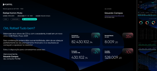
We also mapped the end client's perspective: what information they received, how they understood their portfolio health, and what a trustworthy, legible report would look like for someone who is not a financial expert. That informed both the balancing tool and the report template.
Balancing interface. The core of the tool. One screen where the consultant sees the full portfolio, makes adjustments, and immediately sees all cascading effects, allocations, totals, health indicators, uninvested dividends. One interaction, full visibility.
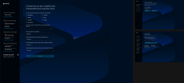
Client onboarding flow. Full onboarding flow for new clients, from initial intake through profile definition and first portfolio allocation, structured around Portfel's methodology from day one.
Client report. A generated report sent to end clients summarizing portfolio status, performance and recommendations, translating the advisor's complex view into a clear, trustworthy document for the investor.
Visual identity and design foundation. Portfel had no product identity. We built it from zero, color system, typography, component library, UI kit and proto design system, alongside a consultant training guide.

Portfel had no visual identity before this project. We designed the full product language, color system, typography, component library and iconography, starting from zero. The direction was precision and trust: a tool that feels as reliable as the methodology it supports.